Research
At my universities student run agency "The Bird's Nest" I am in-charge of redesigning our agency website. In my research of different agencies I found that that successful agency websites tend to focus their user flow on their landing page. They typically have all the information a client wants to see on one page so they done have to click through a bunch of things. So this task of combining all necessary information of our landing page was my start.
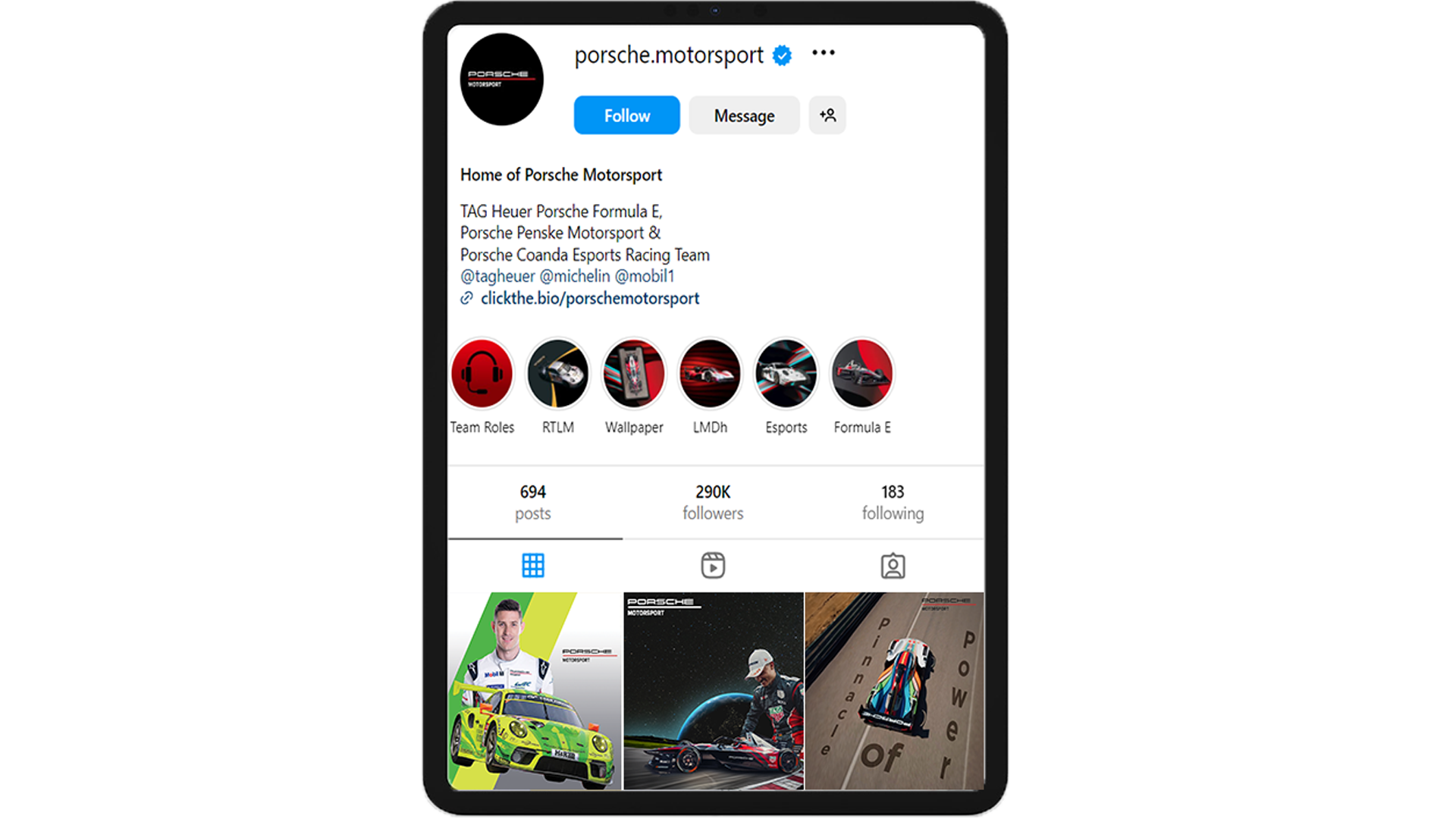
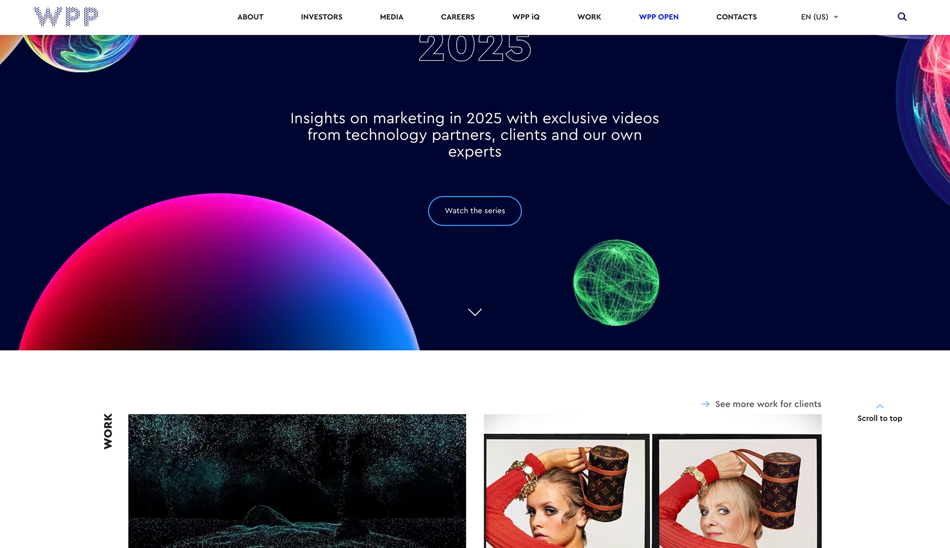
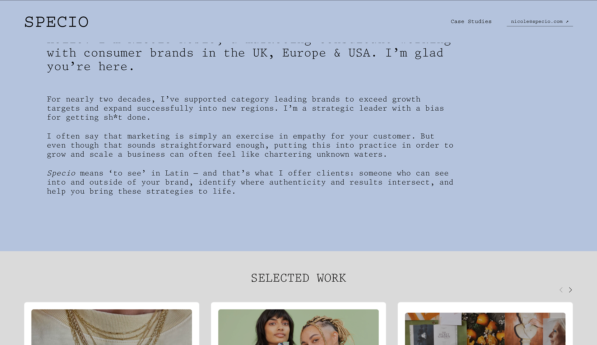
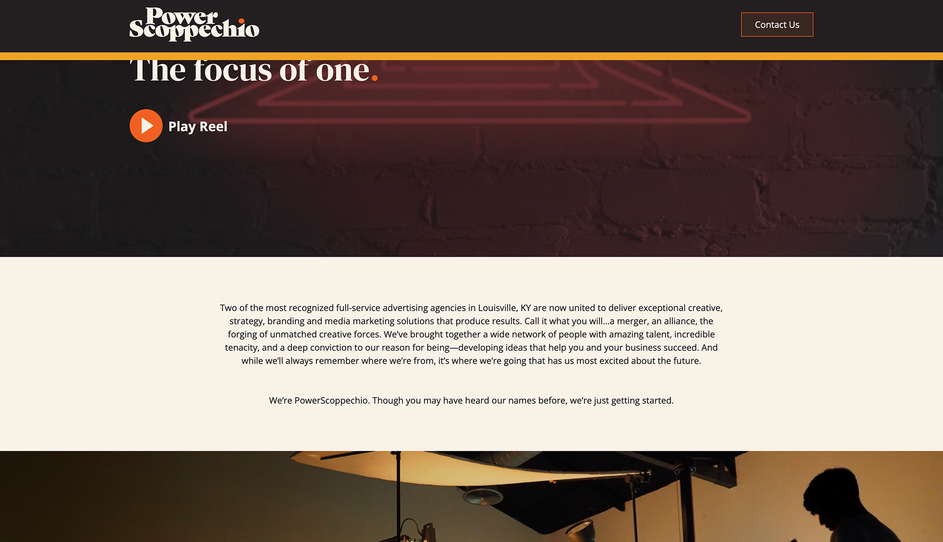
Below are some successful agencies that follow a user flow that makes it quick for potential clients to find what they are looking for.
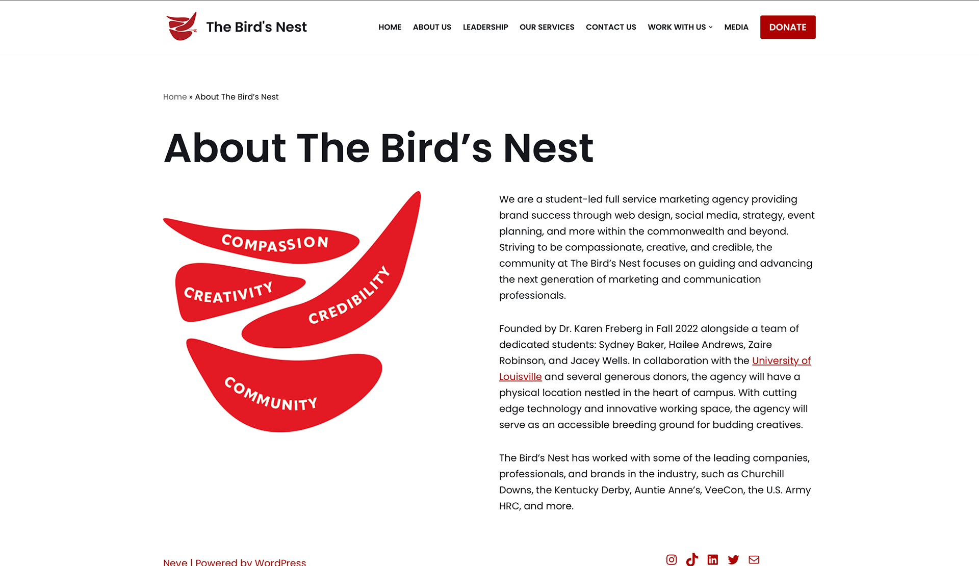
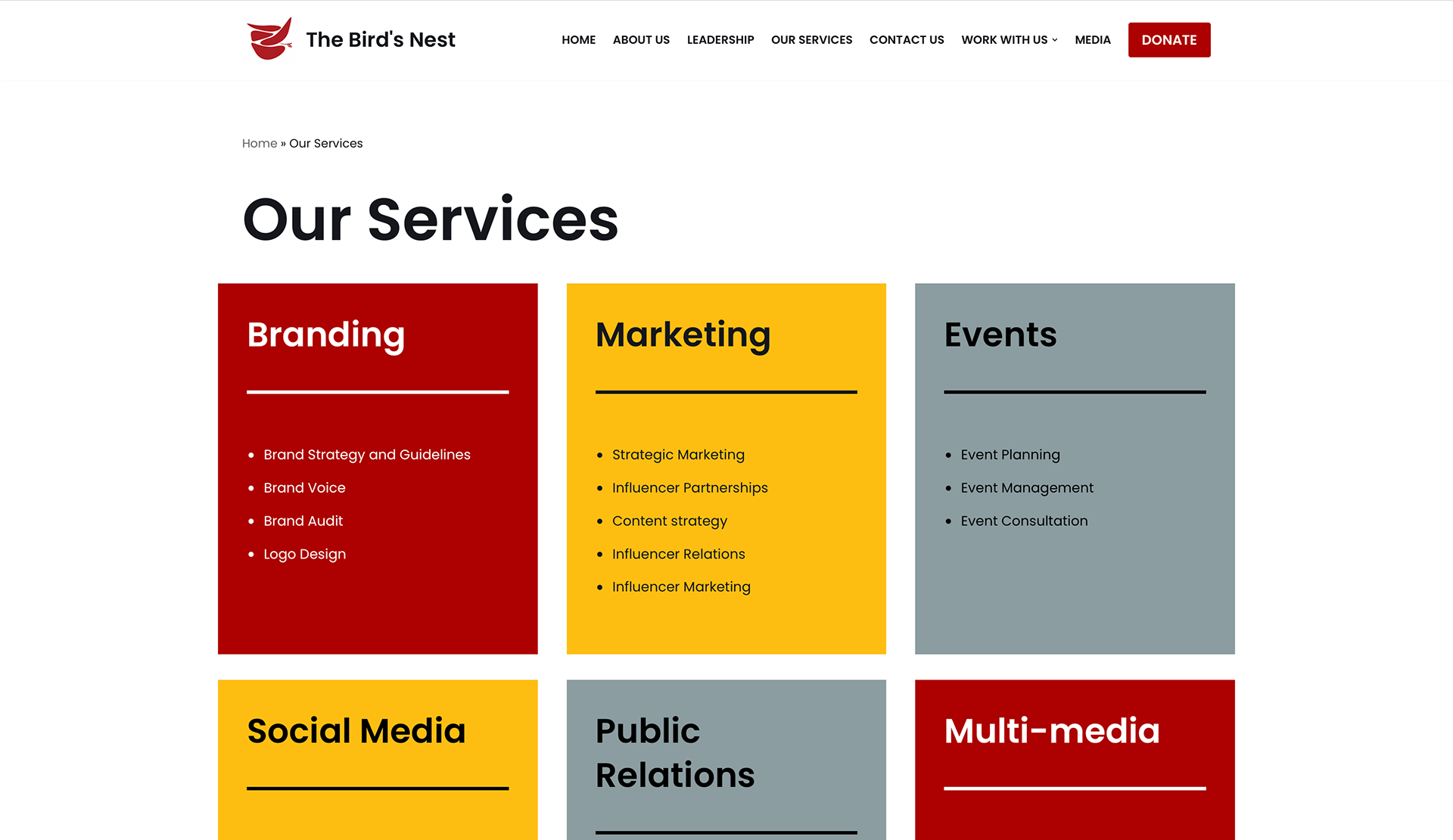
Applying this thinking to our current agency site definitely does not make it easy for potential clients to find what they need.
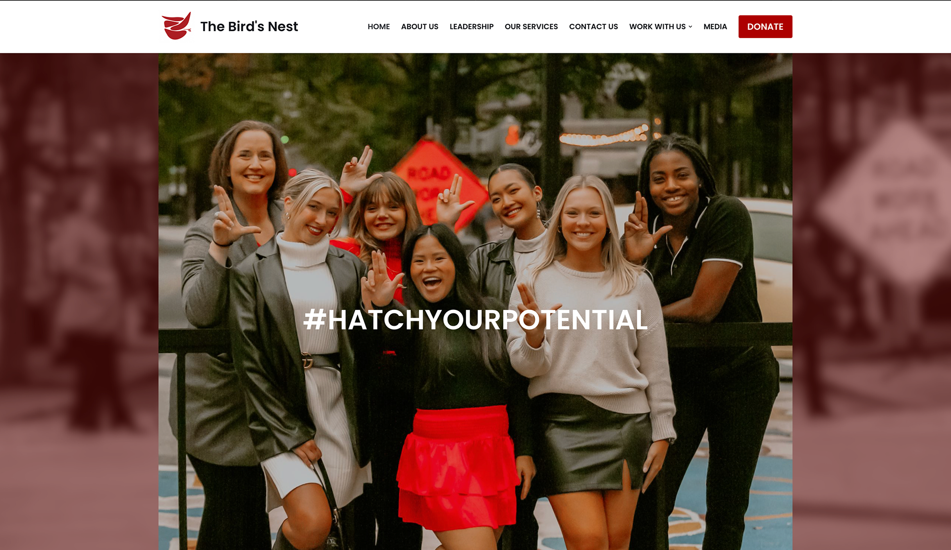
Below is the site we currently use and every section is on its own page and some of the links don't work so it was time that I put some work into that.
Design
I started at the plethora of tabs that this is the banner of our site. In the many agency sites I research a lot of them used this order.
The main thing I have had a problem with in the design I were to put the "DONATE" button. I came to the conclusion that in the final version of the site donate button shouldn't be in banner but somewhere on our home page and towards the bottom of the rest of the pages.


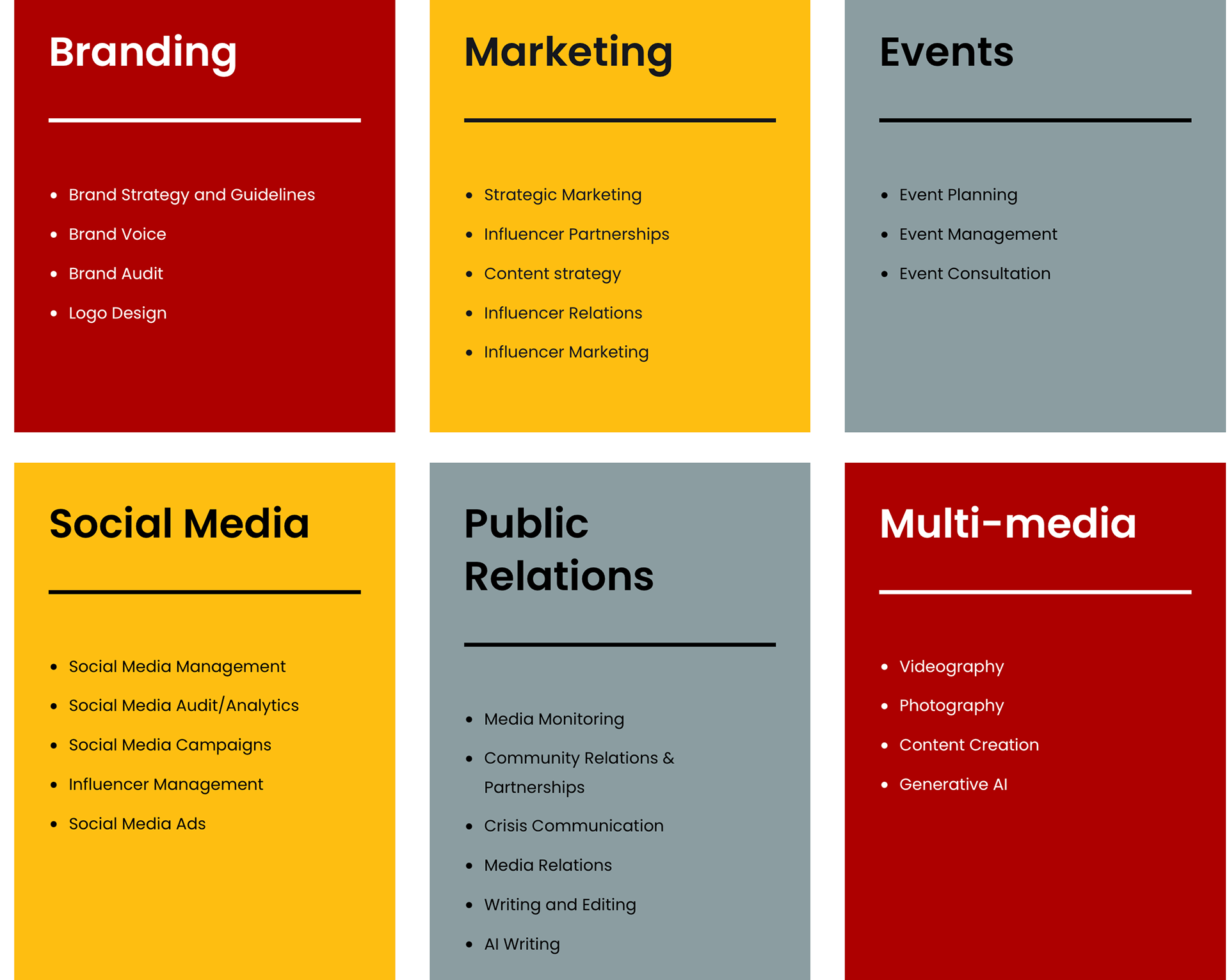
To incorporate some interaction on the landing page I decided to start drafting some ways of displaying some of our best work.
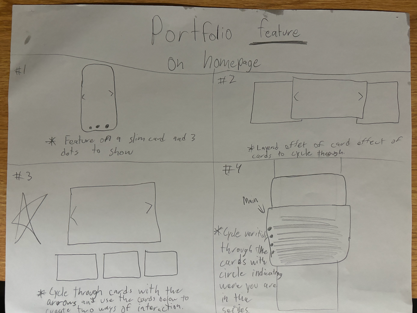
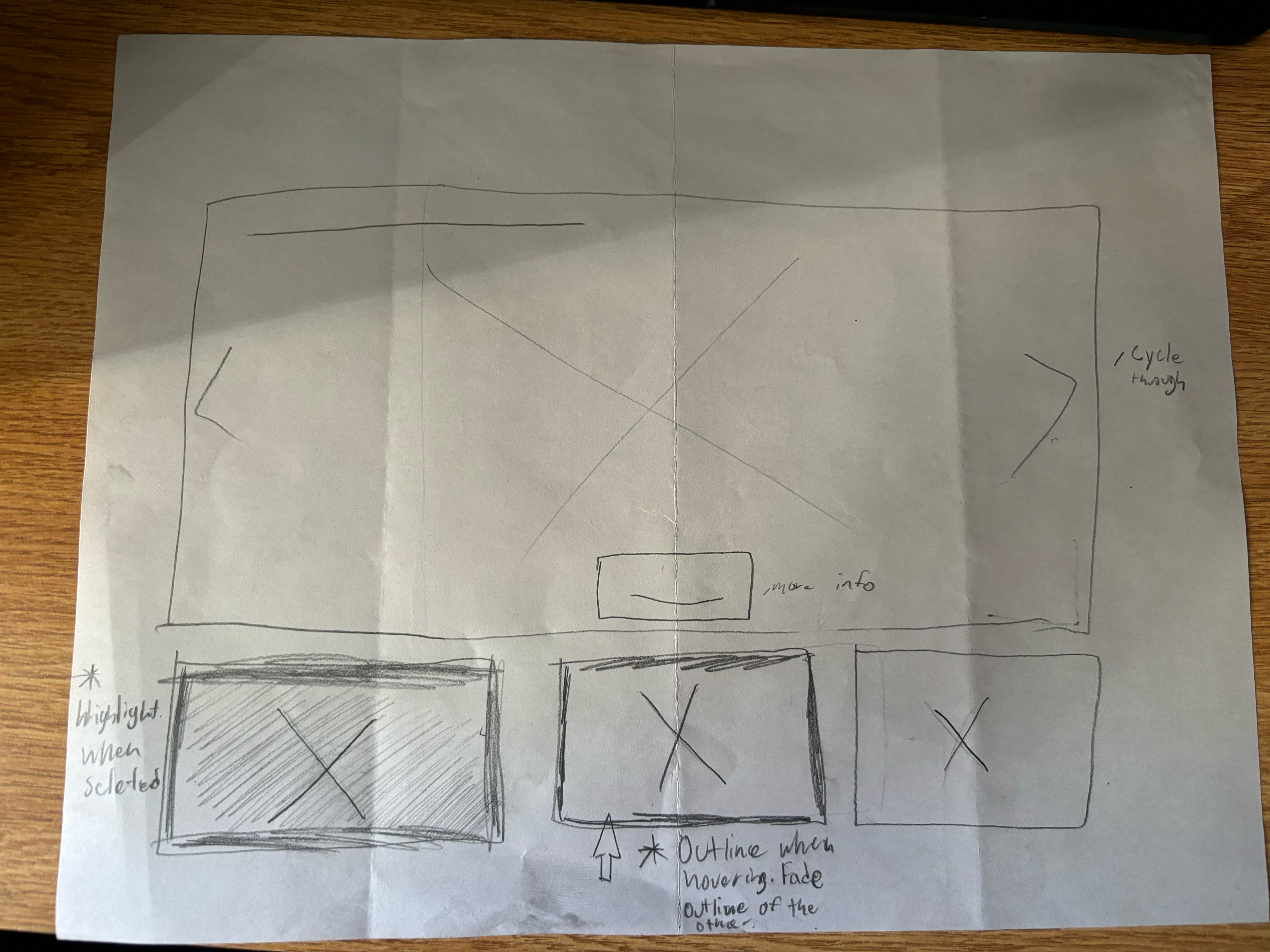
I pitched my top four ideas to my director and she picked the third option for me to expand on. I decided to make this part of the page variant focused so I could test out different animations and transitions.
I also made the each picture slowly zoom after being selected. using after effects I created and exported gifs and imported them into Figma.

Next I wanted to experiment with different ways of making this page more interactive and including it on the landing page. I had few ideas from just using the main heading as a section with no explanation to using pictures alone. I decided to use an interactive button group to display each thing we do. This draft I created has animations and each section has its own pictures.
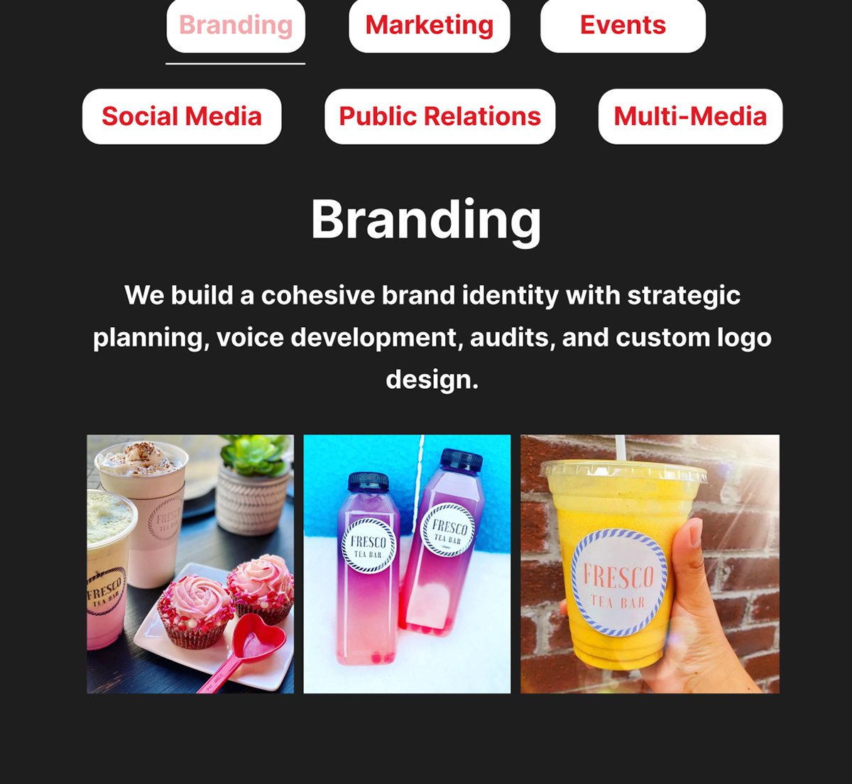
This is the final mockup for the landing page. In terms of web content I am done and passing on the exact layout and order to my content director in the agency.
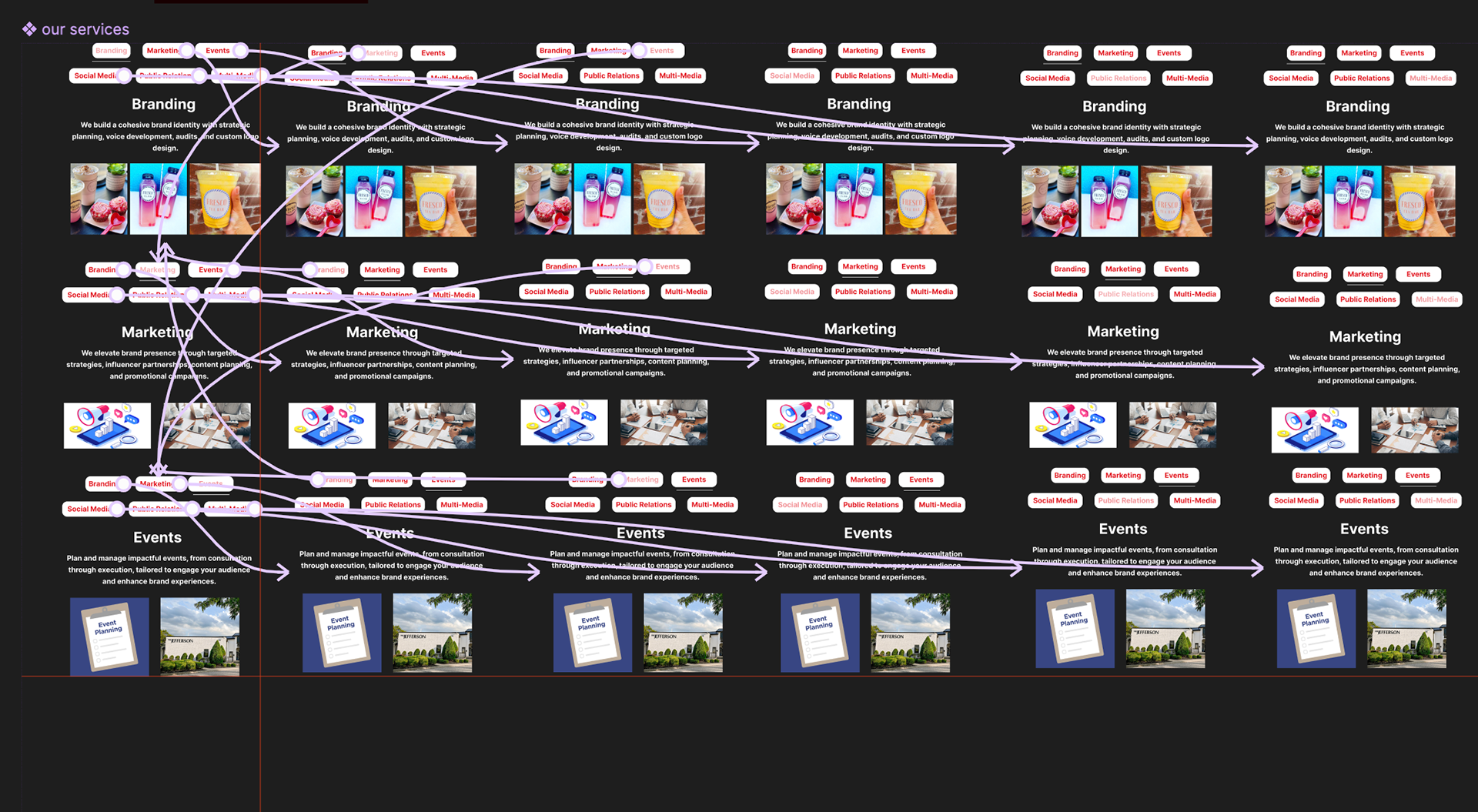
A big part of this project was learning how to correctly organize my wireframes. The amount of variables and components those interactive pieces needed exceeded my expectations. It was challenging but I finally found the work flow to keep everything organized that I could go back and fix anything that needed to be fixed.